Let’s face it: the changes you’re going to see in smartphones every year are pretty incremental. With some significant exceptions (I’m looking at you, user interface of the iPhone X), today’s phones aren’t all that much different than the phones of three years ago. Faster, yes, More memory, sure. Better cameras, absolutely. Smaller bezels, it’s true.
But different? Well, no. Not really.
The two most significant changes are the rise of “plus” or XL supersized models and watertightness. The latter is a terrific feature, and one that’s saved me thousands of dollars. But as much as I like a lot of screen real estate, I still have trouble wrapping my head (and hands) around today’s plus-sized phones.
All of that makes it hard to build up much enthusiasm about Samsung’s newest Galaxy S9 and S9+ phones. Each annual revision of the Galaxy line, accompanied by vast global event sponsorships and an impossibly splashy introduction, undoubtedly moves the state of the smartphone art ahead a notch. And the S9 line is one of the three or four phones I would recommend to someone looking for a top-of-the-line smartphone. More importantly, alone among those phones, it offers legitimate enterprise features that demand your attention.
The Galaxy S9 is, by any rational measure, an excellent phone and measurably better than its predecessor. “Excellent” and “measurably better,” however, are not the same thing as “exciting.” It’s an unreasonable metric to be judged by, but there it is.
Classic Samsung design
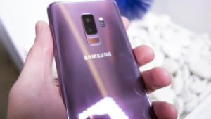
The Galaxy S9+ is immediately recognizable as a Samsung design. It’s 6.25-in. x 3-in. x 0.33-in. of Gorilla Glass 5-covered aluminum, weighing 6.6 ounces. The 6.2-in. display (measured diagonally) is a super AMOLED screen with the Samsung-characteristic curves along the long edges; it offers an 18.5:9 aspect ratio displaying 1550 x 2960 pixels. Subjectively, it’s slipperier than hell to hold. At least the thing is waterproof to IP68 standard: that means five feet immersion for 30 minutes. You can get it in black, lilac, or blue, with the colors being nicer than I expected.
 Michael Simon/IDG
The power switch is on the right edge, the volume rocker and Bixby switch (yes, Bixby’s back) are on the left, with the SIM/SD card drawer on top and the USB-C port and 3.5mm headphone jack on the bottom. On the back is a dual-lens camera, flash, heart-rate monitor, and fingerprint sensor (located just below the camera instead of next to it). You’re less likely to smudge the lens than you were in earlier models.
Quick Charge 2.0 is supported, as is wireless charging. It’s got a 3500mAh battery that should last all day and then some. There’s an NFC chip for Samsung Pay, Bluetooth 5.0, and a media player that will play MP3, WMV, AAC and FLAC files. For the first time, the Galaxy has stereo speakers – one playing through the earpiece, the other from the bottom edge. They meet the Dolby Atmos spec and are plenty loud.
The whole thing is powered in the U.S. and China by an up-to-date eight-core Qualcomm Snapdragon 845 chipset. (As usual, chips in the EMEA market are different, but equivalent.) It’s got a generous 6GB of RAM, is available with 64GB, 128GB or 256GB of storage and runs Android 8.0 (Oreo).
(The regular sized S9 is essentially identical save for size. It’s 5.75-in. x 2.75-in. x 0.33 inches, and has only one camera on the back; there’s no wide-angle element. Its battery is 3000mAh. We did not have that model in hand, but have no reason to think it would perform differently than its big brother.)
A flexible UI
One of the distinguishing features of Samsung’s top-end phones is the customizability of the user interfaces (UIs). Where a phone like Google’s Pixel 2 opts for simplicity by reducing UI choice, Samsung goes with a cornucopia approach. Without going into great detail, Samsung lets you pick from four subtle presets of screen appearance, as well as manually set the color temperature and suppress red, blue, or green pixels.
You can also decide on handed-ness, swapping the Back and Recent buttons. If the very existence of the navigation bar bugs you, you can make it disappear entirely – permanently or temporarily – by double-tapping on a dot in its left edge. Swiping up from the bottom restores it; while it’s gone, force-pressing where the Home button would be rewards you with a haptic buzz and gets you to the home screen. It may be a little uncomfortable to have a screen with no evident navigation, but it works pretty well with the iPhone X and it works pretty well here, too.
You can equalize sound manually or set a sound profile based on your age. And “edge apps” return, putting shortcuts on screens that you activate by dragging inward from the display's curved edges.
The category-leading Camera
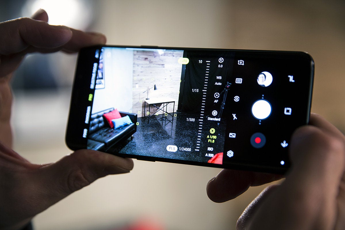
Samsung’s entire promotion surrounding the Galaxy S9 series pretty much centers on its improved camera. The primary camera now opens from f/2.4 to f/1.5 in low light, or about half an f/stop, which is significant. In practical terms, the low-light performance is noticeably improved. In some of my tests with stage lighting, which is a tricky environment, the camera had a tendency to blow out the better-lit parts of the stage, which is not a problem you expect to have with a smartphone camera. The DXOmark folks gave the S9+’s camera a rating of 99, just ahead of the Google Pixel 2, iPhone X, and Huawei Mate 10 Pro.
 Christopher Hebert/IDG
Samsung's camera—and camera app—has been greatly improved on the S9.
The S9 line’s video camera can now shoot 2160p at 60 fps (up from 30) and 1080p at 240 fps (up from 60), allowing slow-motion video at HD resolution. There is also a super slo-mo mode – 960 frames per second at 720p resolution. The bad news is that it’s finicky to use, needs lots of light to work well, and is such a resource hog that the super-slo-mo clips are only 0.2 seconds long. But do the math: at 960 fps, a 0.2-second clip contains 192 images at 720p resolution. That’s mighty fast shooting.
Technical achievement aside, the super slo-mo mode has some legitimate business applications. A field service rep trying to closely examine or diagnose a rapidly moving part can take a video in that mode and step through to see where in a cycle a malfunction might be occurring.
The camera can be set to take a selfie by voice command or showing it your palm. You also can decide which camera modes to make available or merely reorder them in the interface. If you don’t want Food or AR Emoji to clutter your life, you can turn them off or move them to the end of the list. It’s very handy.
Exclusive enterprise features
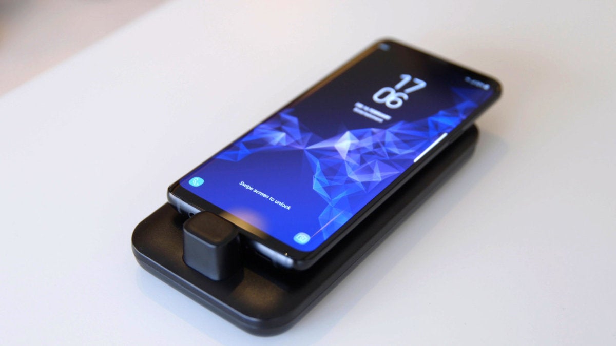
Like the S8 line, the S9 supports Dex, a full-screen Android desktop powered by the phone. You plug the phone into a small docking station connected to an HDMI monitor, and you can use the phone like a desktop computer. Last year, you needed an external mouse and keyboard (Bluetooth worked fine, but you could plug in USB devices.) This year, you don’t need the keyboard or mouse; the phone’s screen acts as a touchpad and the desktop displays a virtual keyboard. Conventional peripherals are still supported, though, if you prefer that option.
 Martyn Williams/IDG
A Galaxy S9 phone sits on a Samsung Dex dock.
While it really isn’t suited as a heavy-duty work computer, the setup is vastly better than cramming a desktop experience into a phone screen. In environments that are constrained for space, dollars, or time, this Dex capability is highly useful, unique to Samsung and could easily tip a buying decision. It’s no Note 8 tablet, but it solves a similar problem in a friendlier form factor.
This year’s model of the Dex dock positions the phone flat; last year’s stood it upright. This year’s is more convenient, but last year’s does work.
Galaxies also include Samsung’s Knox security system. Among its handy features is the ability to allow access to a secure folder using a different fingerprint than the one used to unlock the phone itself.
What’s not fully baked
There are some other technology hills that Samsung keeps trying to climb without reaching the top. Iris scan unlocking returns on the Galaxy S9, but it still isn’t fully finished. Glasses confuse it, and the warnings that accompany it – the scanner might hurt the eyesight of babies and anyone who holds it too close to their eyes – do not instill confidence. (The fingerprint scanner works better than fine for unlocking, as do PIN and patterns.) But if face unlocking is a deal breaker for you, there are other choices
Bixby, Samsung's personal assistant, is still desperately undercooked as well. There’s a dedicated Bixby switch; you can now disable it, though not reassign it for some other purpose. Supposedly, Bixby can translate printed signs in many languages, and while Samsung’s press demo was cool, the real-world results were not. Bixby still falls far short of Apple’s Siri.
The newest hill Samsung is choosing to die on with the S9 is something called AR Emoji. It’s best imagined as a competitor to Apple’s Animoji, but more complicated, more customizable, and creepier. It promises to create animated emojis that look like you, but does a worse job of it than a Nintendo Wii. I bet some kids might like it – if kids could afford Galaxy S9s. Everyone else will try it once.
Pricing, availability and final thoughts
Pricing starts at $720 for the S9 and $840 for the S9+, although given the competitive landscape it wouldn’t surprise me to find aggressive bundling and discounting even at launch this week. You can pre-order now from all major U.S. carriers plus US Cellular and Xfinity mobile, the usual big-box stores and their affiliated online presences, and MVNOs Cricket Wireless and Metro PCS. Phones are expected to be in customers’ hands on March 16.
Despite my concerns with features like the iris scan and Bixby, the Samsung Galaxy S9 and S9+ rank among the best and most flexible smartphones you can buy. Enterprise customers in particular will find some highly useful features not duplicated anywhere else. For everyone else, the buying decision will be a balance between price, physical feel, operating system, and the degree you want to tweak the way your phone works.
https://www.computerworld.com/article/3262528/android/review-samsungs-new-galaxy-s9-phones-make-excellence-routine.htmlBagikan Berita Ini


0 Response to "Review: Samsung's new Galaxy S9 phones make excellence routine"
Post a Comment