Google has pulled a surprising switcheroo, designing Android P to help you reduce your smartphone usage, while also making it less irritating and more approachable. To pull that off, it added a big dose of artificial intelligence smarts, iPhone X-like swiping gestures, and a new "digital wellbeing" dashboard. It may even help with that perennial smartphone issue: Battery life. Should you decide to try Android P -- and you can, today, on a variety of devices via the public beta -- here's a guide to the major features that could make you more efficient and less attached to your smartphone, in a good way.
A new way of navigating and switching apps
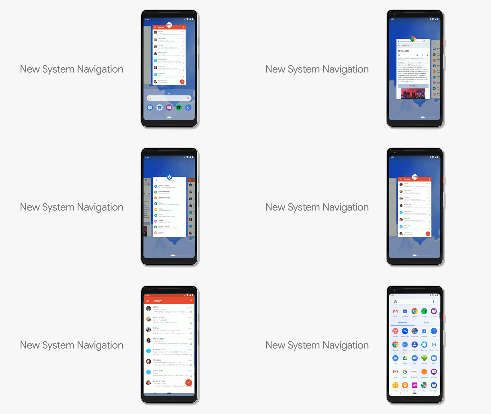
Smartphones are getting longer, slimmer and the screen is taking up more of your device's real estate. This has lead to both physical and virtual home buttons gradually disappearing. In Android P, Google has added new swipe-based navigation to Android P, similar to what we've seen on the iPhone X and current Android phones like the Samsung Galaxy S9 and Huawei P20 Pro.
You might find it annoying to change the way you navigate on Android -- I felt the same way when I started using my Galaxy S8, but quickly got used to the small swipe up necessary to summon the back, home and overview buttons. Android P is actually simpler, as the home button is always visible and it takes less swiping to produce the same results as Samsung's flagship phones.

Here's how: The home button is now a flat, rounded-corner rectangle, rather than a square. Tapping that takes you to the home screen, and a long press brings you to the Google Assistant, much as before. However, a small swipe up now brings you directly to the overview screen, rather than making you also tap an overview button, like with Samsung devices.
Remember how you used to scroll up vertically in the overview screen to change to a different app? Forget that. Now, you swipe horizontally, while the AI predicts the five apps you're most likely to open and shows them in a row at the bottom. You can also find the app you want by typing its name into the search bar just above the predictive row.
If you want to do even less work to find apps, just grab the home button and slide it to the right. That will instantly bring up an overview-like screen (but without the search bar and or predictive row of apps), letting you drag to quickly find the app you want.The back button is still around, but only in apps, rather than on the main Android P screens.
Adaptive Battery and brightness settings

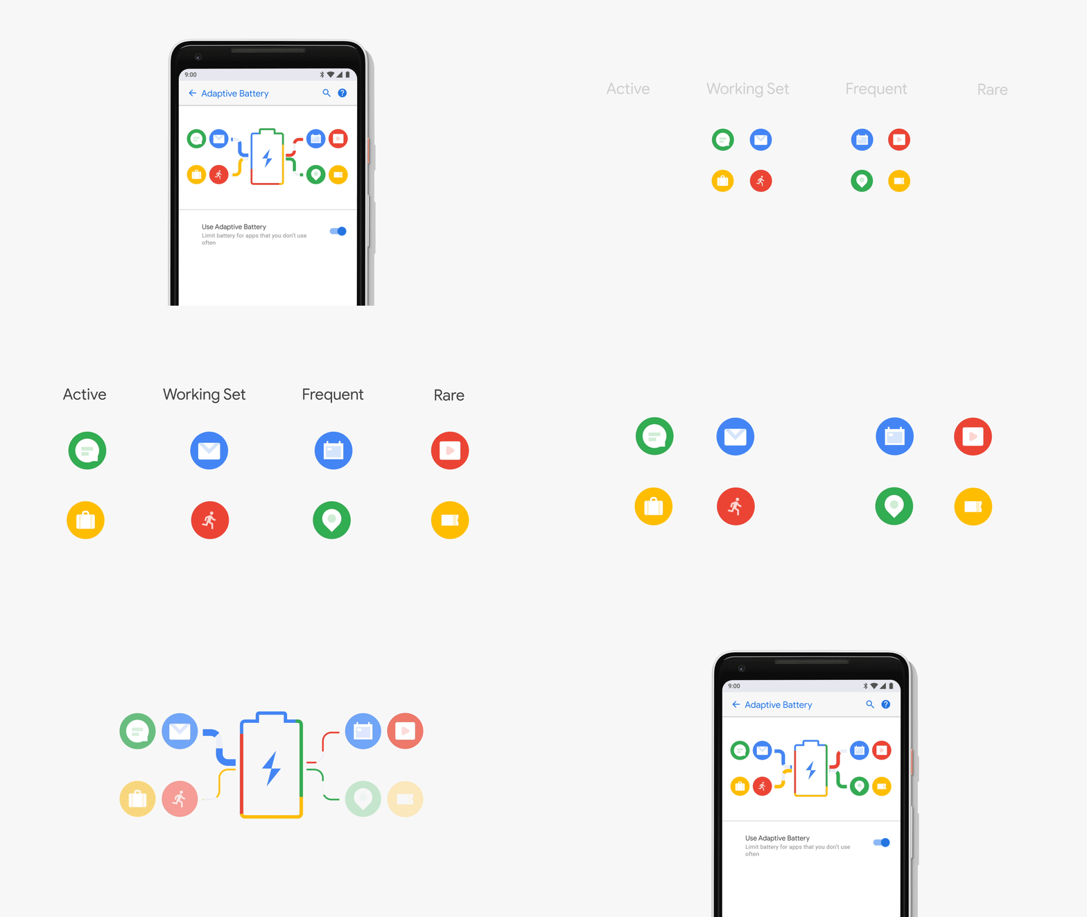
The best part of the new AI-powered features is that many don't require any action on your part. Battery settings are a case in point -- as it stands now, you have to manually choose a power-saving level you want, which might not be ideal if you're using VR or other power-intensive apps. With the latest version, Google collaborated with Alphabet's Deepmind AI division on a new "Adaptive Battery." Android P guesses which apps you're likely to use over the next few hours, and which will stay idle. It then diverts power to the active apps only, saving battery life.
In a similar vein, Google is using AI to set your screen brightness. It watches how you adjust brightness over time, and changes the adaptive settings based on both your habits and ambient lighting conditions. This saves not only the battery life, but Google found that during testing of the feature, half the users made fewer manual brightness adjustments than before.
App Actions and Slices

With the last Android version, Google found that it could predict the next app you'd use with 60 percent accuracy. Android P expands on that with App Actions, studying how you use your phone to figure out what task you might want to do next. For instance, when you plug in headphones, it might automatically load a playlist from Spotify or a Google Play Music album.
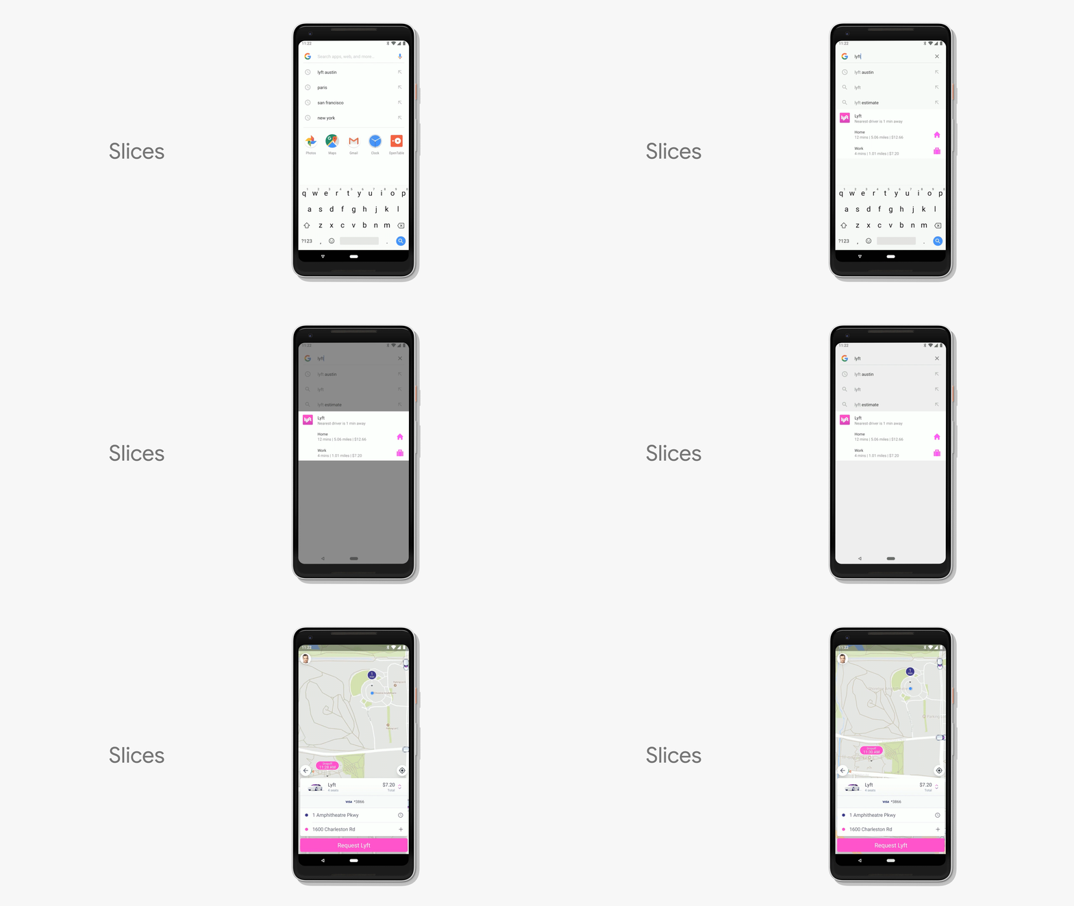
Slices, meanwhile, work directly inside search. If you search for "Costa Rica," for instance, you might see Google Photos from a vacation you took there. Or, when typing "Lyft"' in the Google search box, Android P could take a "Slice" from the Lyft app showing how much a ride home would cost. You can then order the ride directly from Slice, without ever having opened the Lyft app.
Set time limits and wind down
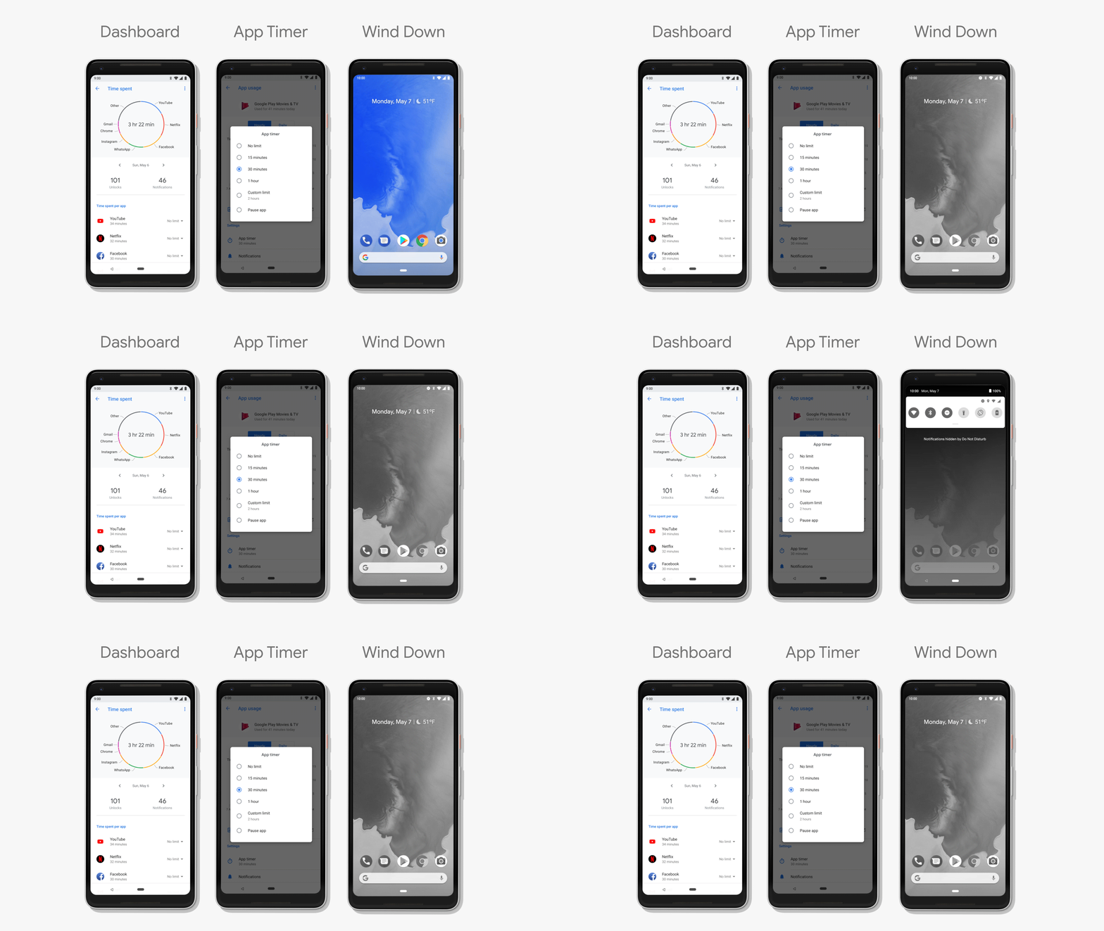
Google is starting to understand the dangers, or perhaps recognize the bad publicity, around smartphone addiction. Android P features a new Dashboard that shows your usage habits in fine detail, like how many times you've unlocked a device, how many notifications you got and how much time you spend in apps. You can also see your total watch time on YouTube and other video services.
Armed with that info, you can set time limits on specific apps for both yourself or your kids. Once you approach the limit, Android will alert you that it's time to move on to other things, and for the rest of the day, that app's icon will be greyed out.

That monochrome trick is utilized elsewhere: It also helps you fight the urge to use your phone when you should be sleeping. First, you tell Google Assistant what time you want to start winding down, and when the hour arrives, it switches the phone into do not disturb mode. More interestingly, it transforms the screen from color to a much less stimulating black-and-white, giving a constant visible reminder and hopefully encouraging you to set your device down.
Finally, Google has gotten more literal with "Do Not Disturb" mode, eliminating all audible as well as visual notifications (from the lock screen, display, and notification drawer). It's also easier to access: Should you decide to take a screen break, just flip your phone into "Shush" mode by laying it with the display down. You won't get notifications of any kind after that, except from your family, work or other designated contacts.
Smarter Notifications
Notifications can either be handy or irritating, depending on whether you're waiting for a message or trying to have a siesta. Android P will use a combination of AI and improved design to make them work more optimally.
If it notices that you often swipe away notifications from a specific app, for instance, the OS will either prompt you to disable notifications for that app, or you can long-press on it to change the settings. You can also hit the "manage notifications" button at the bottom of the notification tray, and see all your app preferences. Those can be arranged by how recently you saw them or by which apps notify you the most.
Finally, you can set up your phone to designate specific apps as as "work apps." Those will live in a separate tab in the app drawer, and you can disable them all at once via a toggle. That way, if you take off for a long weekend, you can leave your work behind but still access Instagram and other notifications if you want.
Wrap-up
This list is far from comprehensive. For instance, if you turn off auto screen-rotation, you'll see a tiny icon pop up when you flip your phone sideways, letting you quickly switch into landscape mode -- incredibly handy for video viewing. Google also unveiled Android P support for smartphone notches that have appeared on new devices like LG's G7 ThinQ. You no doubt also caught Google's splashy demo showing how its voice assistant could book you a hair appointment on its own -- that particular feature is a little further away.
For most of us, though, it's the small things that count, so it's good to see that Google is using AI to make everyday chores easier in Android P. If you want to give it a try, and have one of Google's Pixel phones, the Essential Phone, Sony's Xperia XZ2, Xiaomi's Mi Mix 2S or the incoming OnePlus 6, you can test it out. Just keep in mind that it's beta software, so don't use it if you rely entirely on that device. Have you found any other Android P features you think everyone will be using at launch? Let us know.
Click here to catch up on the latest news from Google I/O 2018!
Bagikan Berita Ini


0 Response to "Five ways Android P changes how you will (or won't) use your phone"
Post a Comment