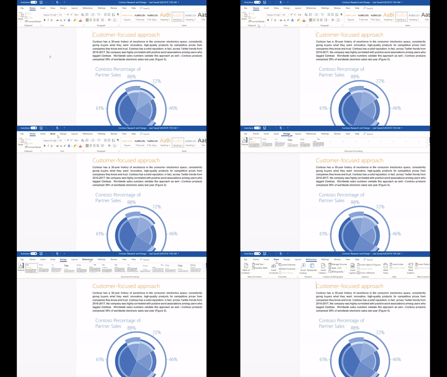
Microsoft is bringing its Fluent Design system from Windows 10 over to its Office apps to simplify them for the billion people that use Office. Word, Excel, PowerPoint, and Outlook are all getting a new simplified ribbon which is smaller and easier to use. The ribbon includes new animations, icons that are designed to be accessible, and subtle color changes to modernize the look and feel of Office. While these changes are coming to Microsoft’s main desktop versions of Office, they’re also coming to the web.
Microsoft has re-built its web version of Office on a modern platform to run faster than it has before, and visually it looks a lot better. The new simplified ribbon is a great fit for the web, and you can still expand it to the larger more classic version. Office on the web will now include avatars for comments and dedicated colors for participants who are also viewing and editing the same document, much like Google’s G Suite.

“Office is used by more than a billion people every month, so while we’re excited about these changes, we also recognize how important it is to get things right,” explains Jared Spataro, corporate vice president of Microsoft Office. “Over the next several months we will deploy new designs to select customers in stages and carefully test and learn.”
Microsoft is testing the simplified ribbon first with the web version of Word today on Office.com, before testing it with Outlook for Windows users in July. Outlook on the web is also getting a new search experience which anticipates contacts, revisiting searches, or upcoming meetings. Microsoft says it’s taking its time with a simplified ribbon for Word, Excel, and PowerPoint on Windows as users have a lot of muscle memory with these versions, but when it arrives you’ll still be able to use the classic bigger ribbon. The new colors and icons will also appear on Office.com first before heading to Outlook for Windows in July and Outlook for Mac in August.

The design tweaks are subtle and welcome additions to Microsoft Office, and the more important changes will be how Office.com now performs. Microsoft’s promise of a faster modern web version of Office sounds appealing, and it’s one we’ll be testing once it’s available.
https://www.theverge.com/2018/6/13/17457800/microsoft-office-fluent-design-simplified-ribbon-office-365Bagikan Berita Ini


0 Response to "Microsoft Office's new Fluent Design overhaul makes it easier to use"
Post a Comment